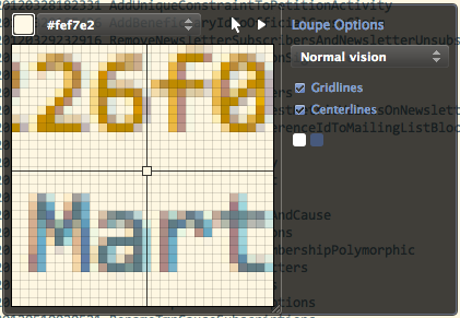
AppleFontSmoothingEdit
These are screenshots of the different possible settings for AppleFontSmoothing that I took on my previous machine with Consolas 13. On my current machine I'm running with Consolas 12.
Smoothing level 1
$ defaults -currentHost write -g AppleFontSmoothing -int 1
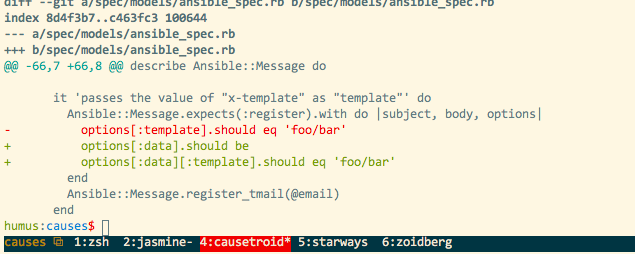
My preferred setting, corresponding to the "Light" font smoothing setting that Apple used to expose in the System Preferences UI.
Smoothing level 2
$ defaults -currentHost write -g AppleFontSmoothing -int 2
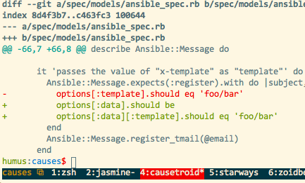
Most comments I've seen on the web come down in favor of this setting, and in isolation, it does look better to my eyes. Nevertheless, the contrast between bold and normal text is more useful at level 1.
Smoothing level 3
$ defaults -currentHost write -g AppleFontSmoothing -int 3
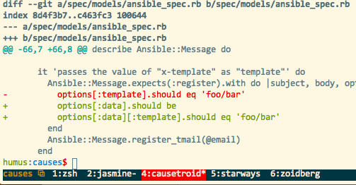
Clearly too thick.
Smoothing level 4
$ defaults -currentHost write -g AppleFontSmoothing -int 4
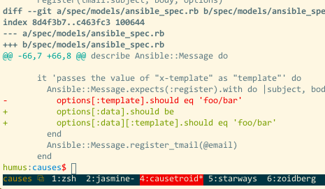
Clearly too thin.
Appendix: zoomed shots
Smoothing level 1
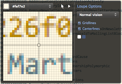
Smoothing level 2
